A thousand years, one trail.
easy to explore
by one trail
East of England Tourism Awards 2021–22
The brief
Rayne has over 1,000 years of history and 67 listed buildings, but visitors had no clear way to find them all. Backed by the Heritage Lottery Fund, our job was to link everything together, with branding that worked on the street, not just on a screen.
Bright, not dusty
We ignored the usual heritage design rules. Instead, we created bright, bold branding that connects printed trail maps straight to physical street plaques. It makes the village easy to explore and proves local history doesn’t have to be boring.
- Client
- Rayne Heritage / Heritage Lottery Fund
- Sector
- Local heritage & tourism
- Results
- Finalist, New Tourism Business of the Year
Finding your way
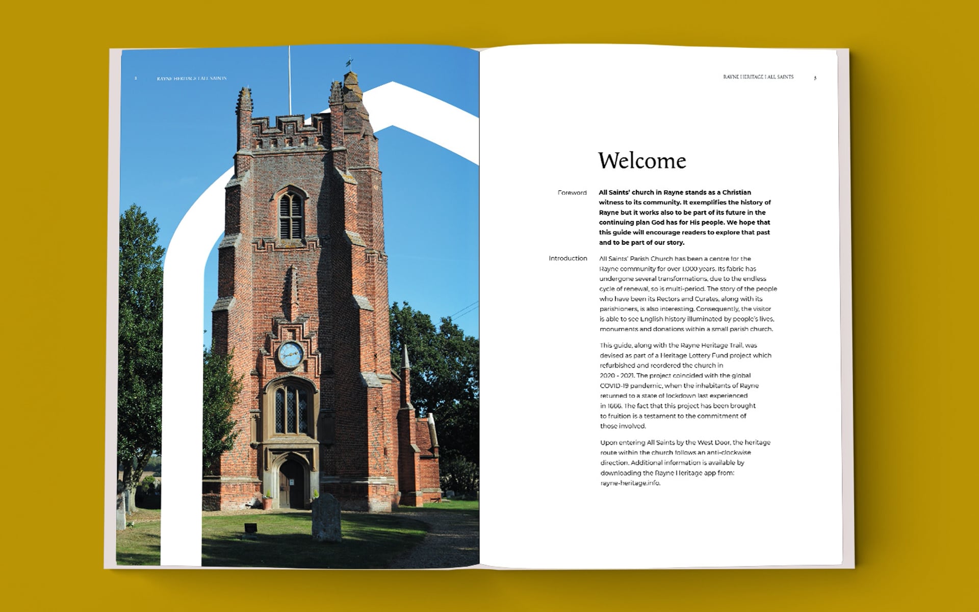
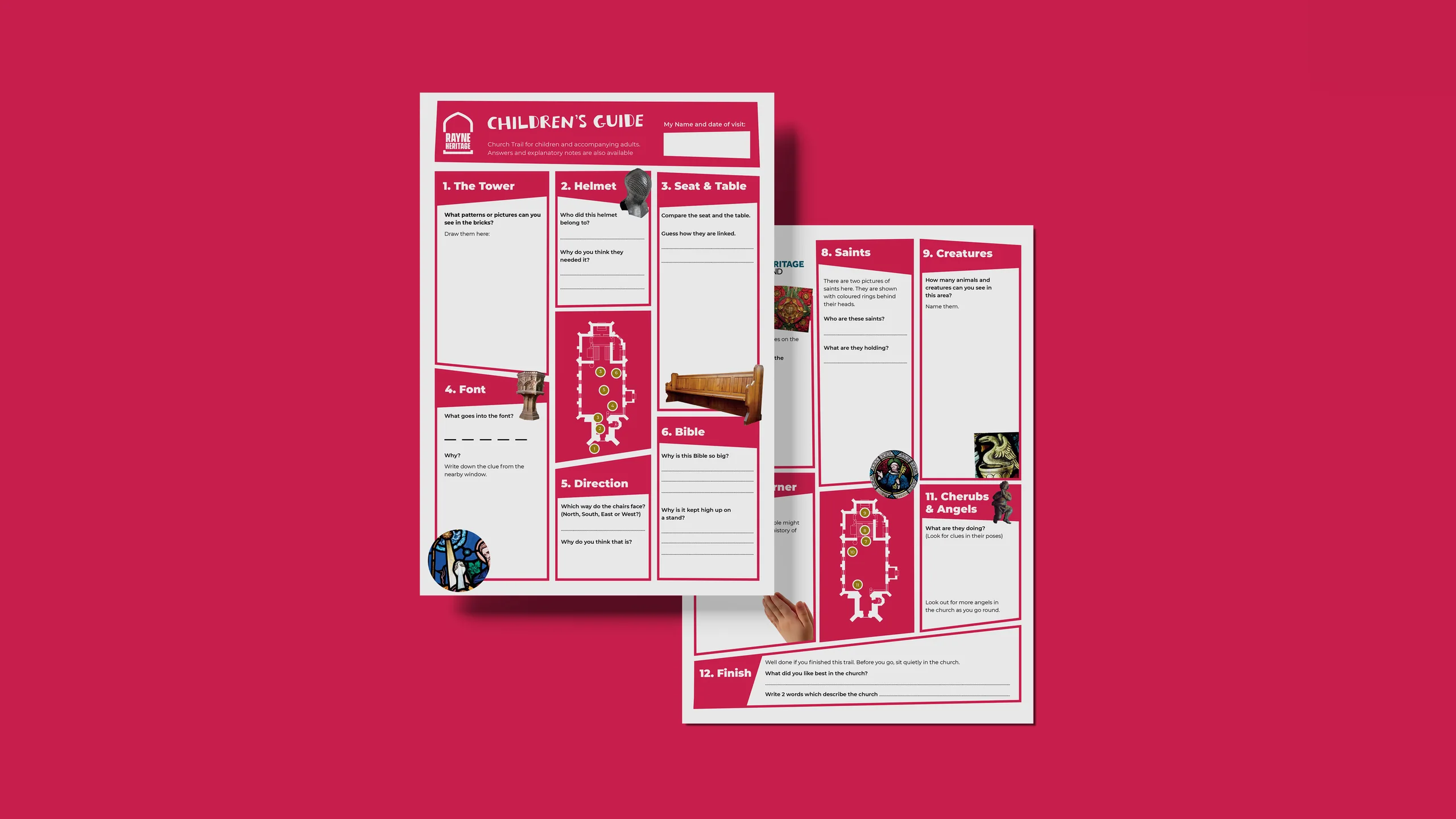
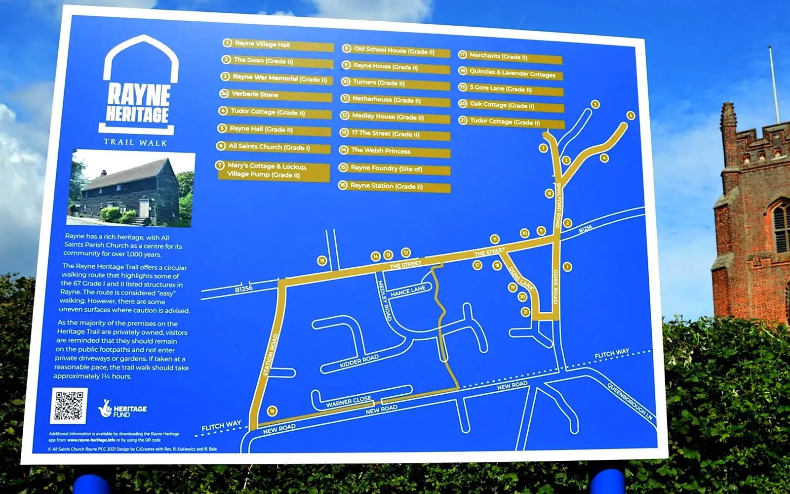
With the identity set, we turned it into the tools visitors actually use. A trail brochure and walk leaflet guide people around the village, a children’s guide makes the church trail fun for families, and the trail map works both as a poster and as signs on the ground, so Rayne’s heritage is easy to find and enjoy.
The pointed arch in the logo does more than sit at the top of the page. It frames the photos on the walk leaflet, holds the building names on the trail map and carries through to the signs on the street, so every piece reads as part of the same trail. Gold and slate grey set the tone for the walking guides, while crimson gives the children’s guide its own character without breaking away from the rest of the family.
Where it’s at now
The result is a trail people actually want to explore. Rayne was a finalist for New Tourism Business of the Year at the East of England Tourism Awards 2021–22.
See how we approach brand identity design.