PotterWoods Furniture make bespoke kitchens, wardrobes, media units and home offices, along with freestanding pieces, all made to measure. They came to us wanting a brand that looked smart and a little intriguing, with a mark that said something about what they do.
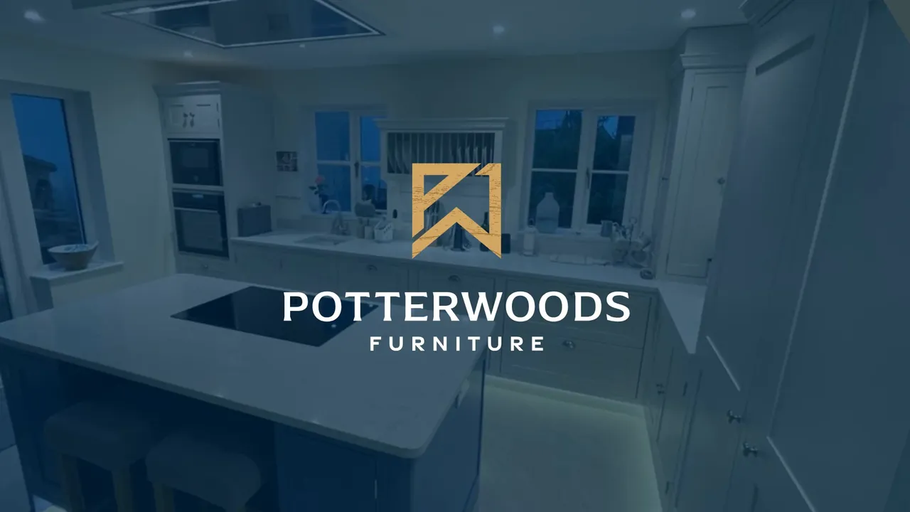
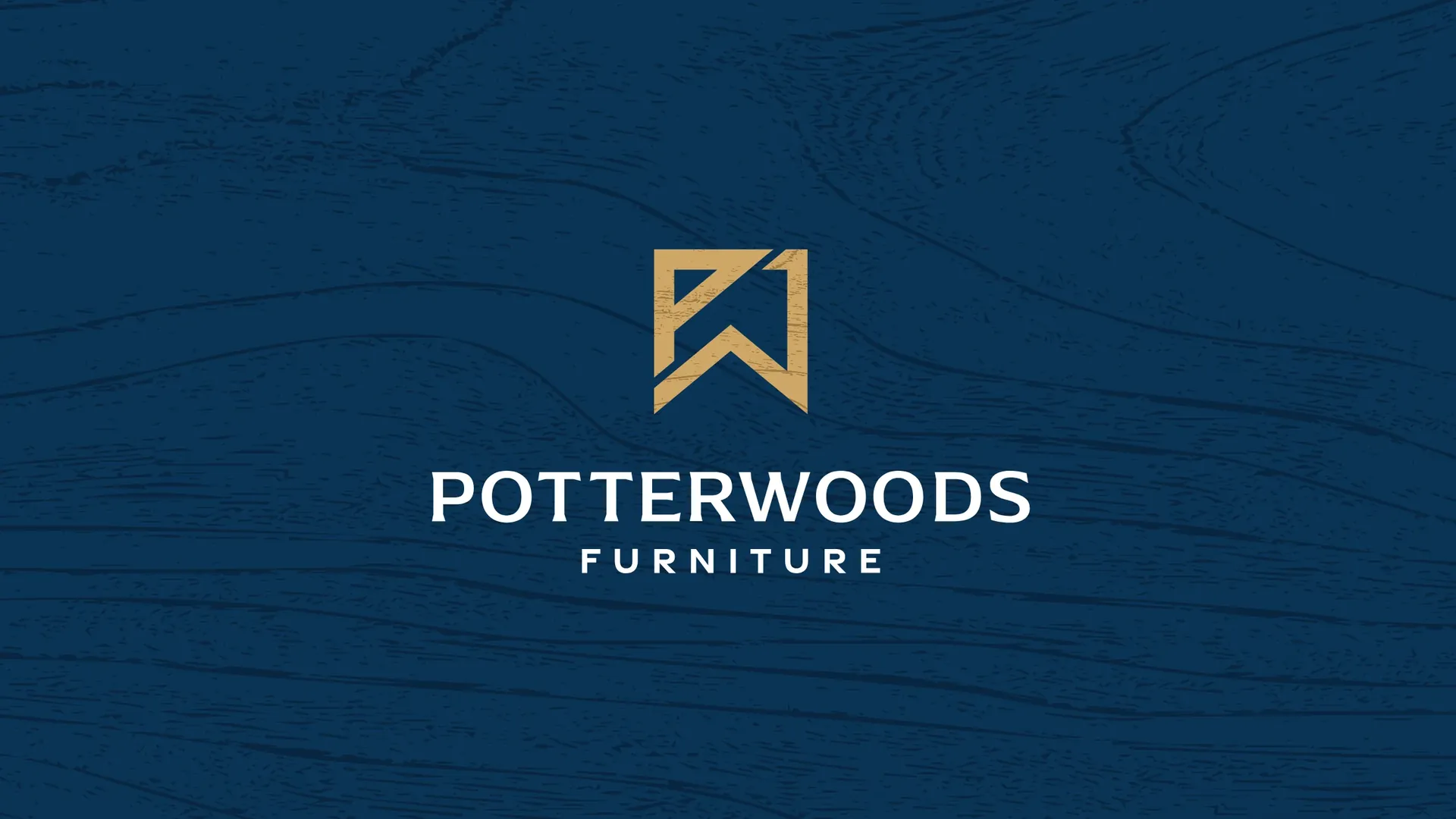
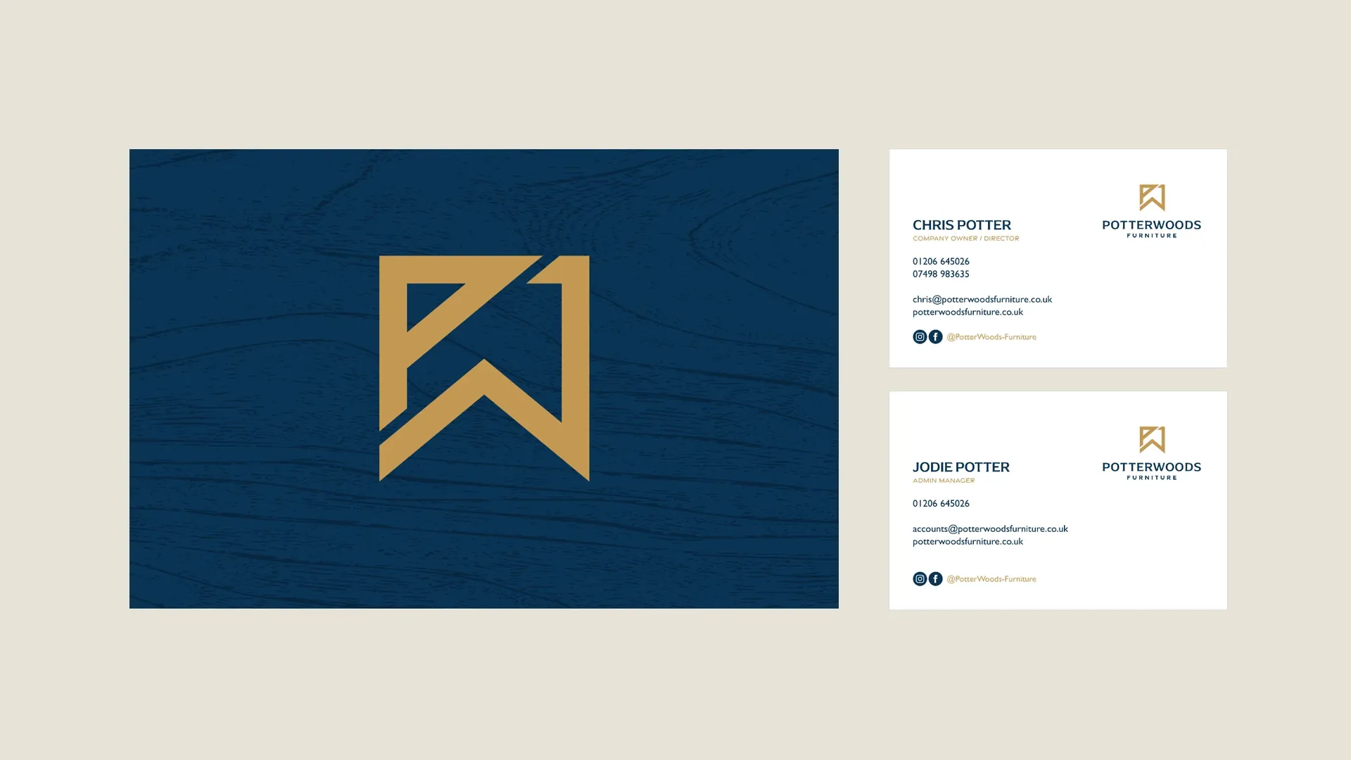
The answer was in the name. P and W are drawn as one gold monogram, with the clean, squared lines of a well made joint. Set on a deep navy woodgrain, it feels crafted rather than corporate. We gave it a line to match: the mark of quality.
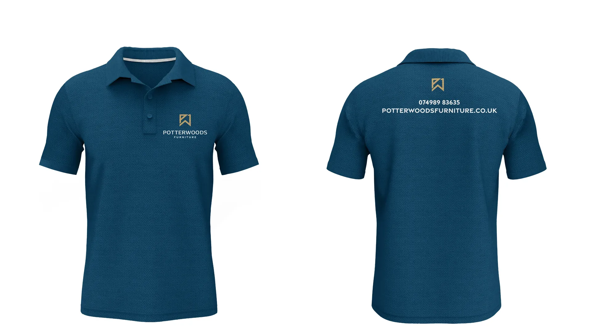
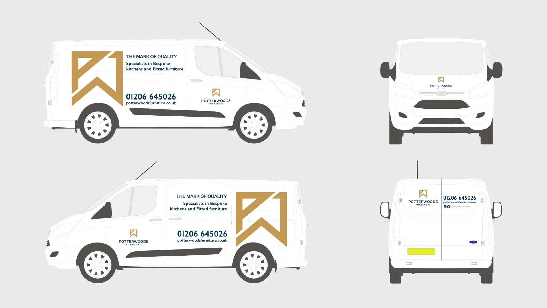
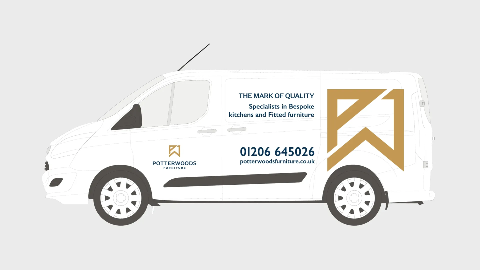
From there we built everything around it: business cards, letterheads, email signatures, polo shirts, van livery and social media, then the website that brings it all together.
- Client
- PotterWoods Furniture
- Sector
- Trades & construction
- Website
- potterwoodsfurniture.co.uk

Made to measure, like the furniture
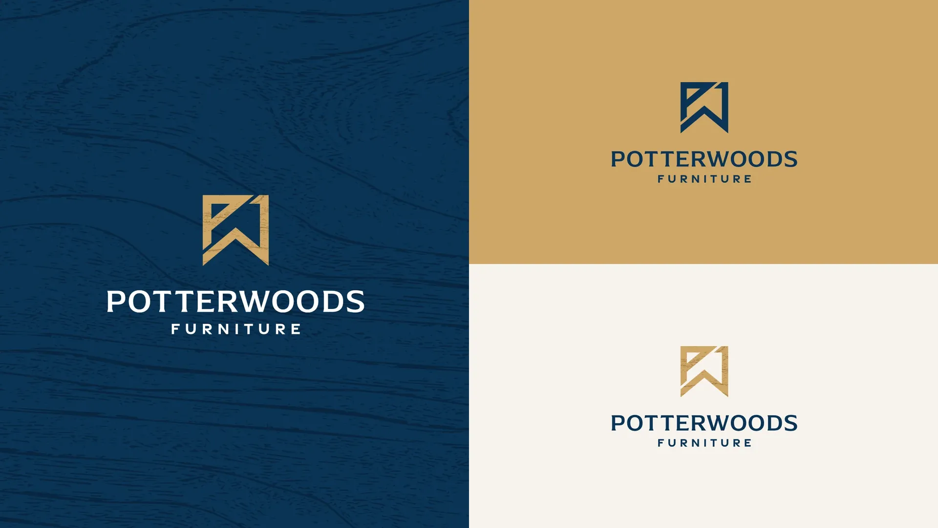
Every piece follows the same few rules. The gold mark leads, the navy holds everything together, and the woodgrain fills the space when there is room for a little more. On the van it stays bold and simple, the mark large in gold on white, so it reads at a glance.
See how we approach brand identity design.

A website that shows the work
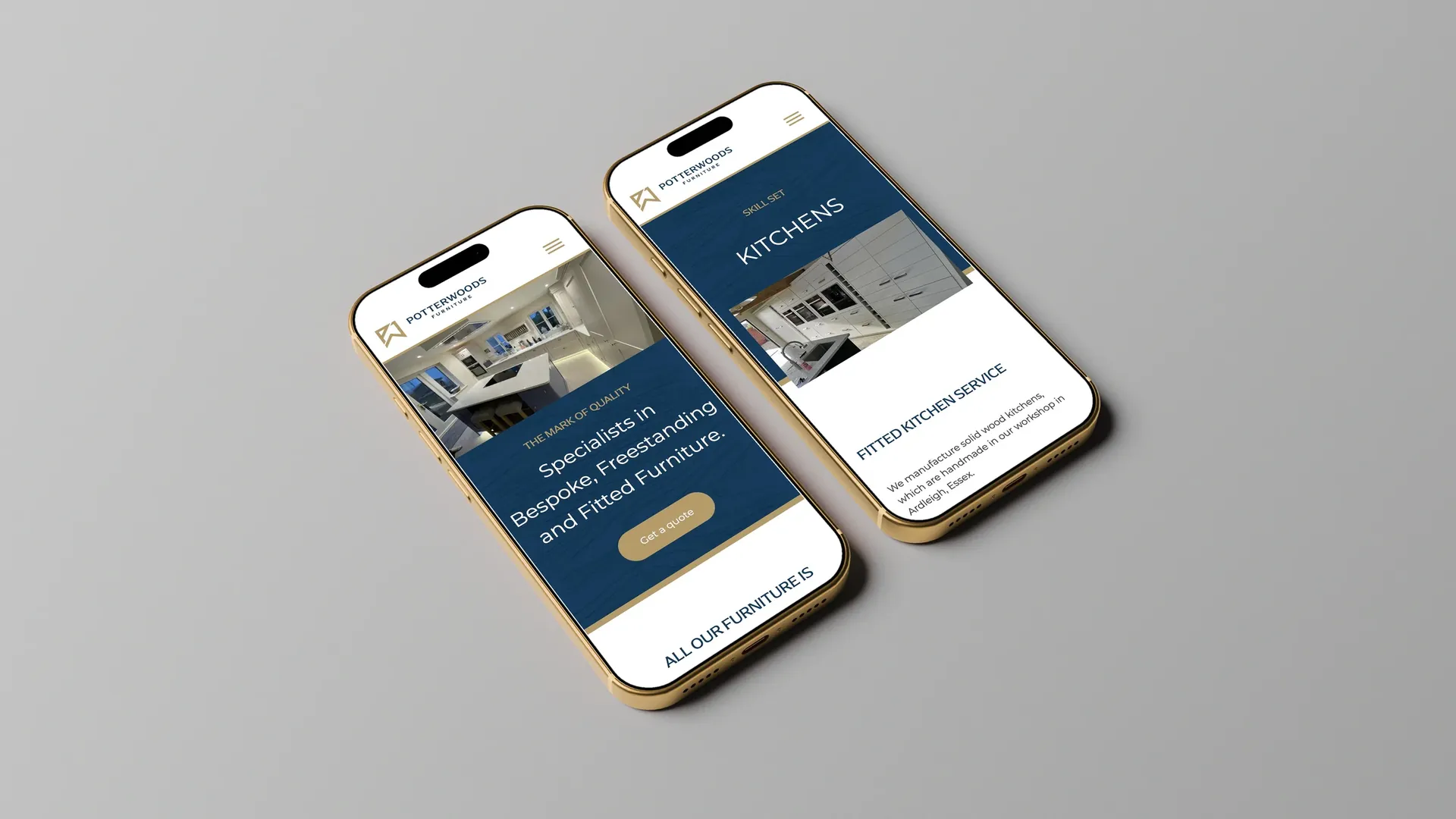
Then we designed and built the website. PotterWoods sell on the quality of what they make, so the site lets the photography lead, with a page for each skill, from kitchens and wardrobes to media units and home offices, and a simple way to ask for a quote. The woodgrain and gold carry straight through from the print, so it feels like the same business wherever you meet it.
See how we approach website design in Colchester and Essex.