More than a building.
the centres
Learn and Grow
from guide to wall
The brief
Colbea partners with local communities to provide accessible workspaces, guidance and training to help small businesses succeed. But they are not just a physical building; they offer a flexible space to work, learn and grow, whether that is online or onsite. They needed a brand that communicated this versatility while building a strong sense of community.
A pin for the place
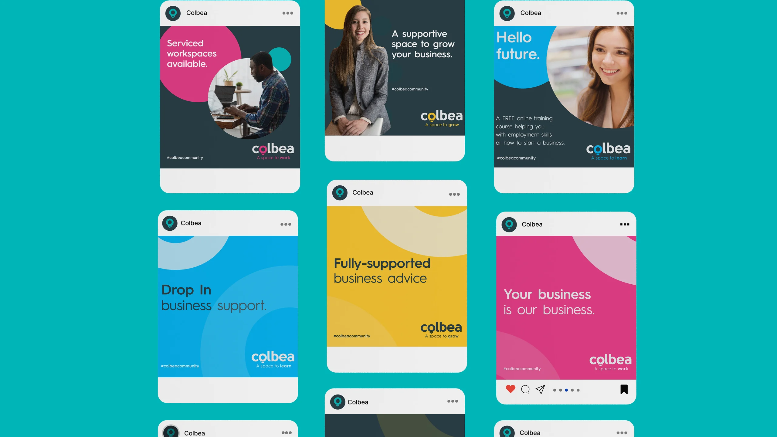
We designed a clean, modern identity anchored by a custom location pin. By replacing the letter “o” in Colbea with this pin, the wordmark itself becomes a symbol for that space. We colour-coded their three core pillars, Work, Learn and Grow, creating an adaptable system that translates into bold social media campaigns driven by the #ColbeaCommunity tag.
- Client
- Colbea

 BeforeAfter
One brand, every touchpoint
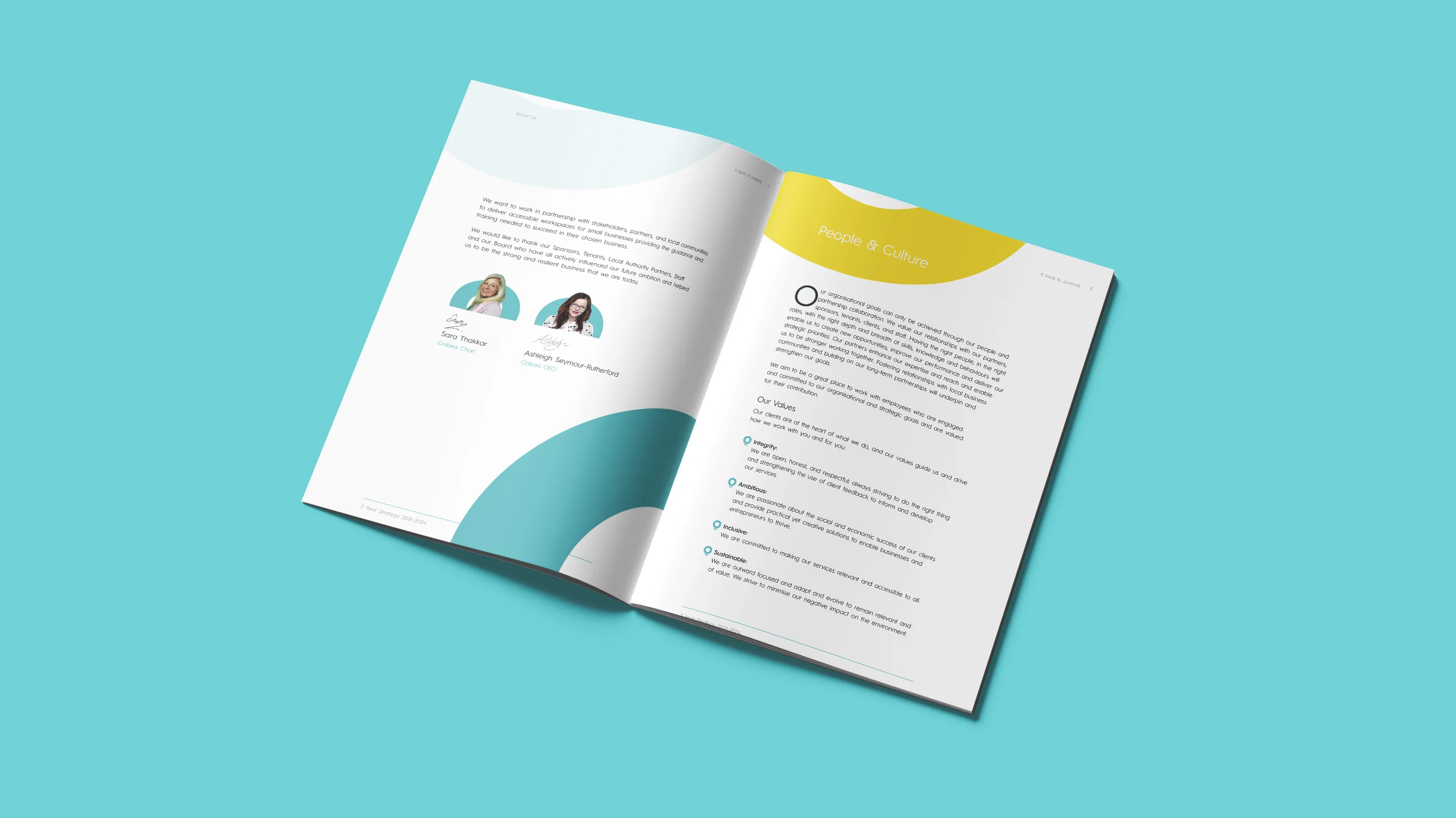
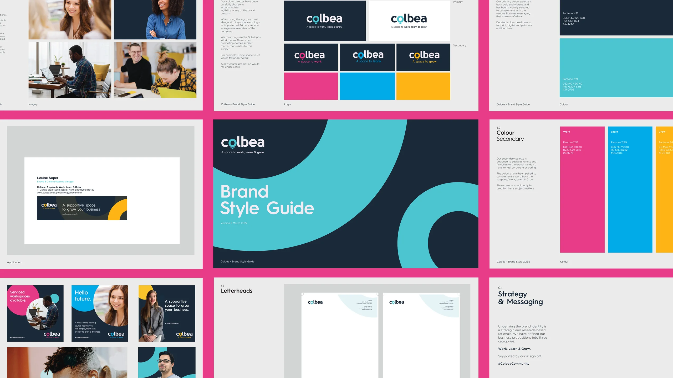
With the identity in place, we turned it into a working system. A brand style guide keeps everything consistent, a three-year strategy brochure sets out where Colbea is heading, and web banners carry the Work, Learn and Grow colours online. In the building itself, the brand runs from the exterior sign to the wall graphics inside, so the space feels like Colbea the moment you walk in.
Where it’s at now
The new look works across physical sites and digital platforms, driving daily engagement through their #ColbeaCommunity social media templates. Today the centres are at 97% occupancy.
See how we approach brand identity design and social media.