
 BeforeAfter
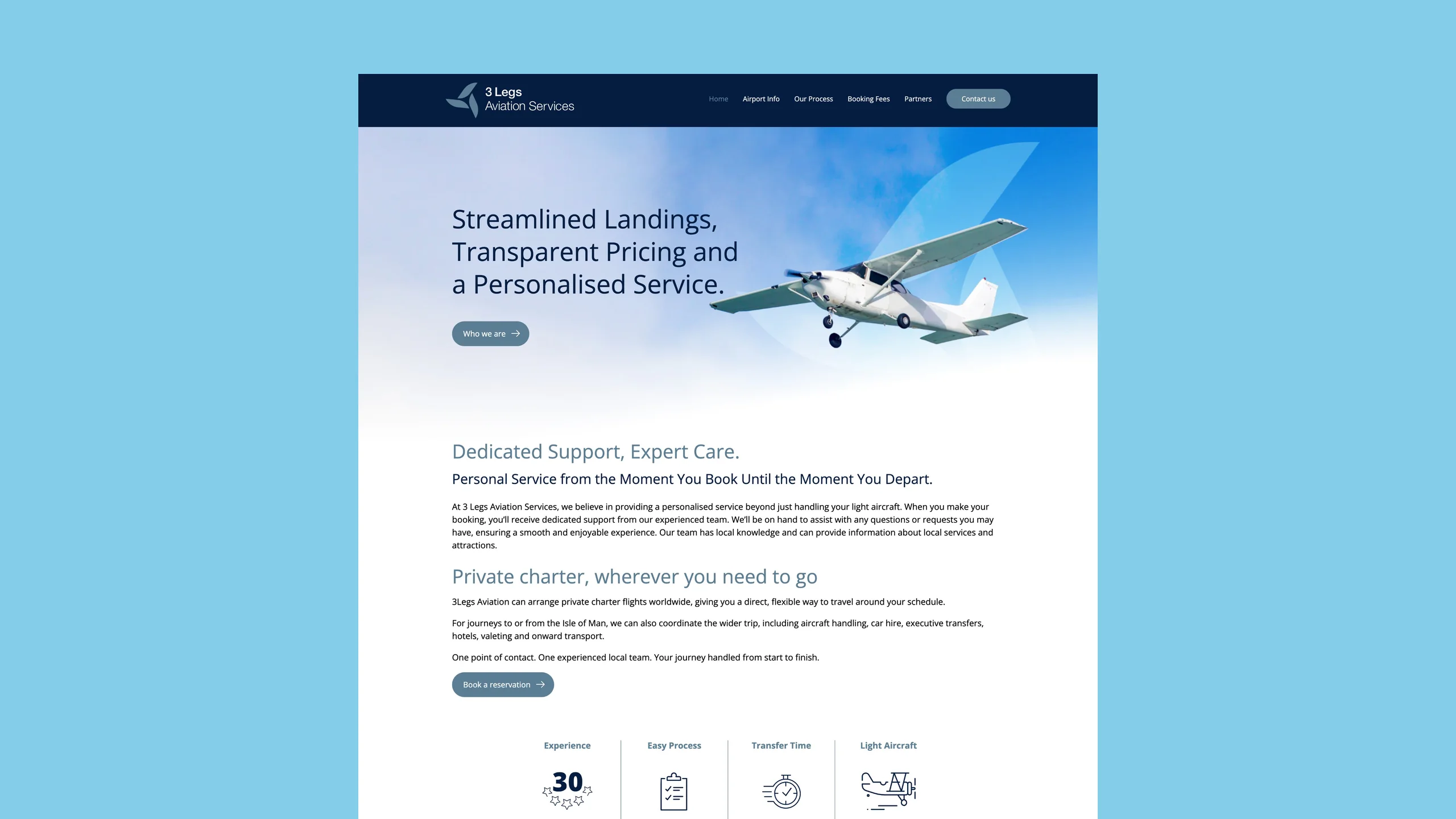
When a light aircraft hangar business was acquired, it needed a brand refresh to bring it in line with the parent group’s wider aviation portfolio. They needed an identity that nodded to their history while looking sharp enough for the modern aviation sector.
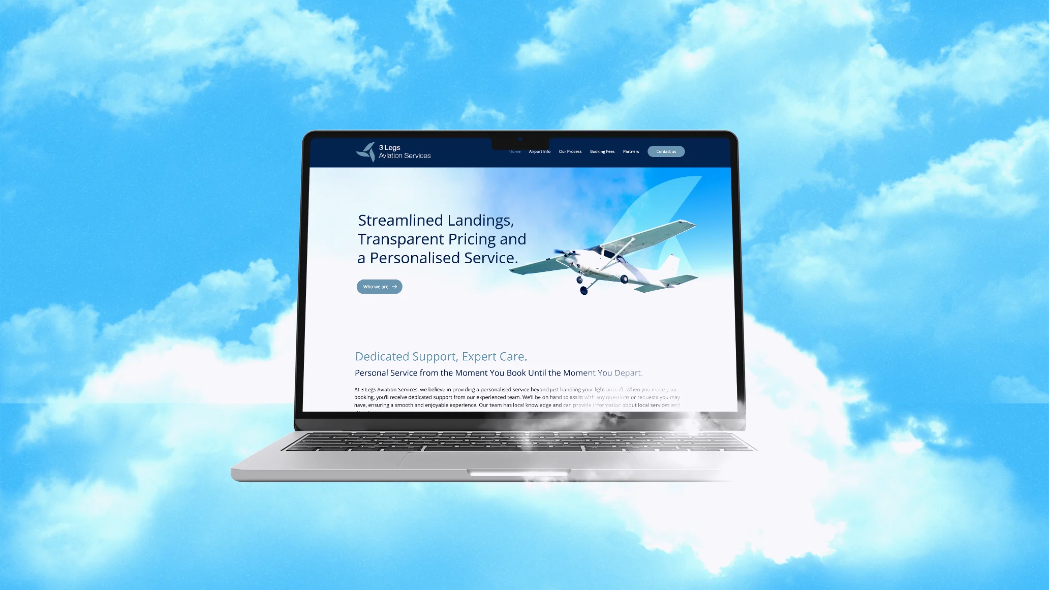
We developed a bold new logo based on the classic “three legs” motif of the Isle of Man. The clever part? We designed the emblem so the three legs subtly double as aircraft propellers, creating a direct visual link to the services they provide in the hangar. This strong, patch-style badge was then rolled out across a clean, straightforward website, so the brand feels robust, professional and completely unified, from the website to the hangar floor.
The result is a cohesive brand that looks the part. The clever logo update respects the company’s roots while making it look instantly at home within a wider, modern aviation group.
BeforeAfter Brands people choose. Websites that win work.
We’d like to use a few cookies to see how people find and use our site, so we can make it better. Nothing for advertising, and only if you’re happy with that.