Peace of mind, not paperwork.
reads like a signature
and considered
since the rebrand
The brief
Beaulieu Wills and Estate Planning provides bespoke, one-to-one advice, but their old branding was sending the wrong message. It was dark, heavy and focused far too much on death. They needed an identity that felt professional and secure, but approached estate planning with warmth and personal care.
Peace of mind, not paperwork
We stripped away the funeral-like look and clichéd legal imagery like scrolls and quills. Rather than selling the service itself, we built the brand around the feeling it gives: the peace of mind of knowing your loved ones will be looked after when the time comes.
At its heart is a flowing “bw” monogram that acts like a personal signature. With a fresh, dual-tone blue palette and clean typography, the identity speaks to contented clients who know their family is in safe hands.
- Client
- Beaulieu Wills & Estate Planning
- Results
- More enquiries and more leads won than in previous years
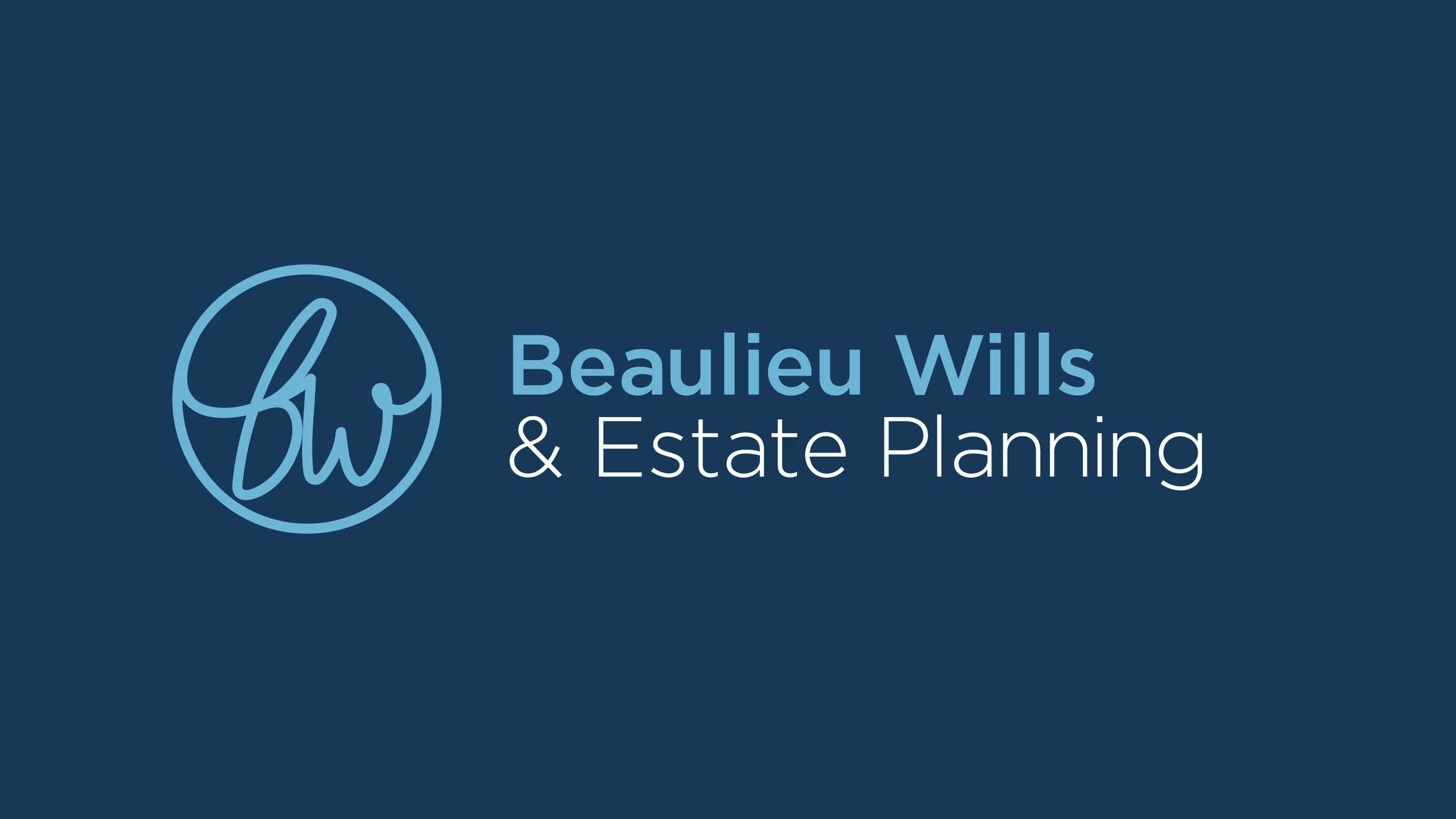
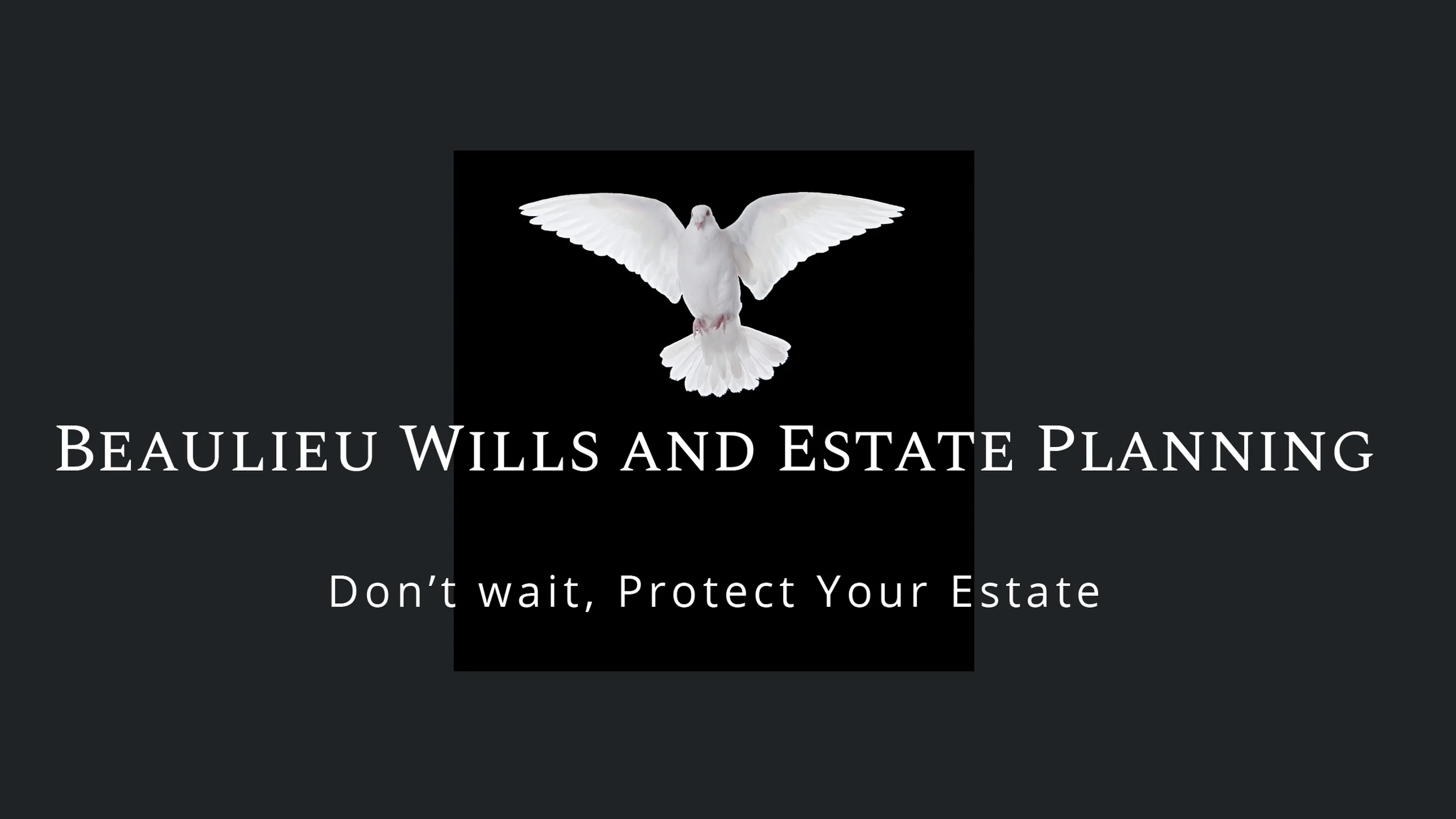 BeforeAfter


Built to flex
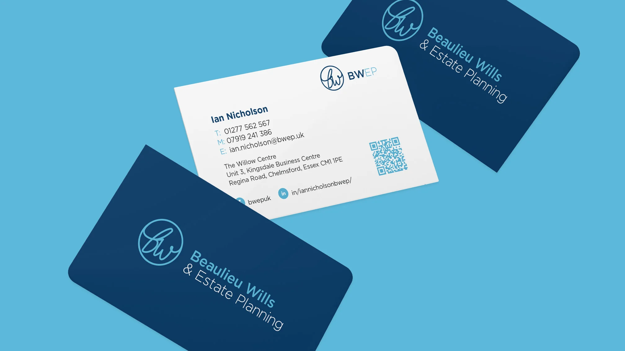
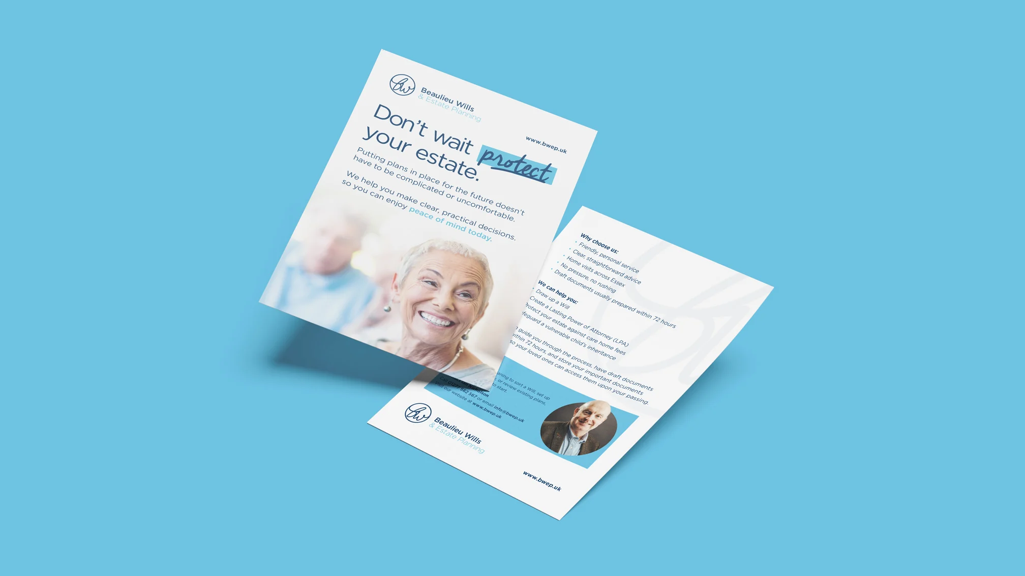
The logo was designed as a system rather than a single mark, with colourways and versions that adapt to each use. That carries through to the business cards, the flyer and the “protect your estate” tagline, so every piece feels calm and considered, which matters when people are trusting you with their family’s future.
Where it’s at now
The result is an approachable identity that puts clients at ease, with serious financial security and a warm, personal feel. Since the rebrand, Beaulieu has had more enquiries and closed more leads than in previous years.
See how we approach brand identity design.