arlo consultancy services keeps businesses safe, compliant and well run, with health and safety and HR support that feels personal rather than corporate. They came to us with a logo they had only recently invested in. It had a good idea at its heart, but a fiddly join between the a and the r, and a gradient that washed out on screen and could not be matched in print.
So we didn’t start again. We refined it: a clean cut between the a and the r, one confident pink on a rich black, and a mono version that works anywhere. The a became a mark in its own right, used as a pattern and as a frame that wraps around and protects, just as arlo does for its clients.
Then came the duck. A black rubber duck, handed out as a prize at an event, became the brand’s mascot, with lines like “get your ducks in a row” and “no lame ducks”. When arlo added HR, a pink duck joined it. As arlo has grown from a one-person business into a full team, the brand has grown with it, across social media, video, print, vans, signage and the website.
- Client
- arlo consultancy services
- Sector
- Health & safety, HR
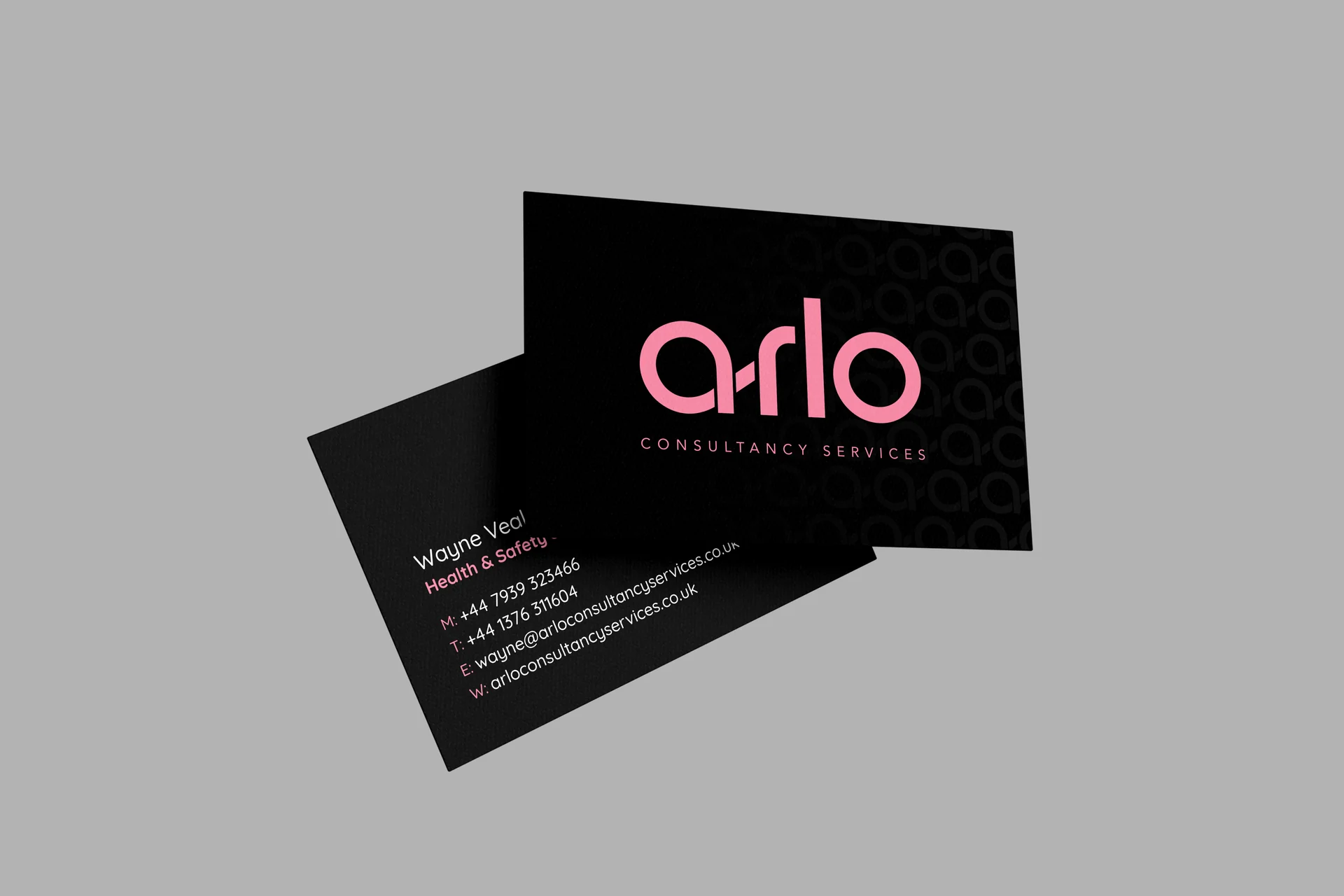
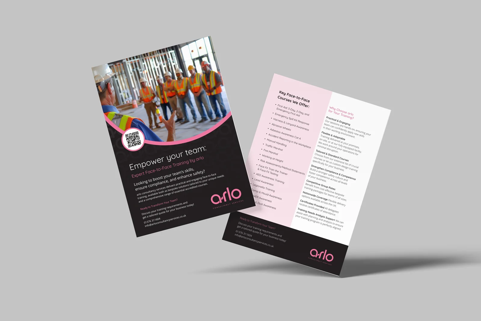
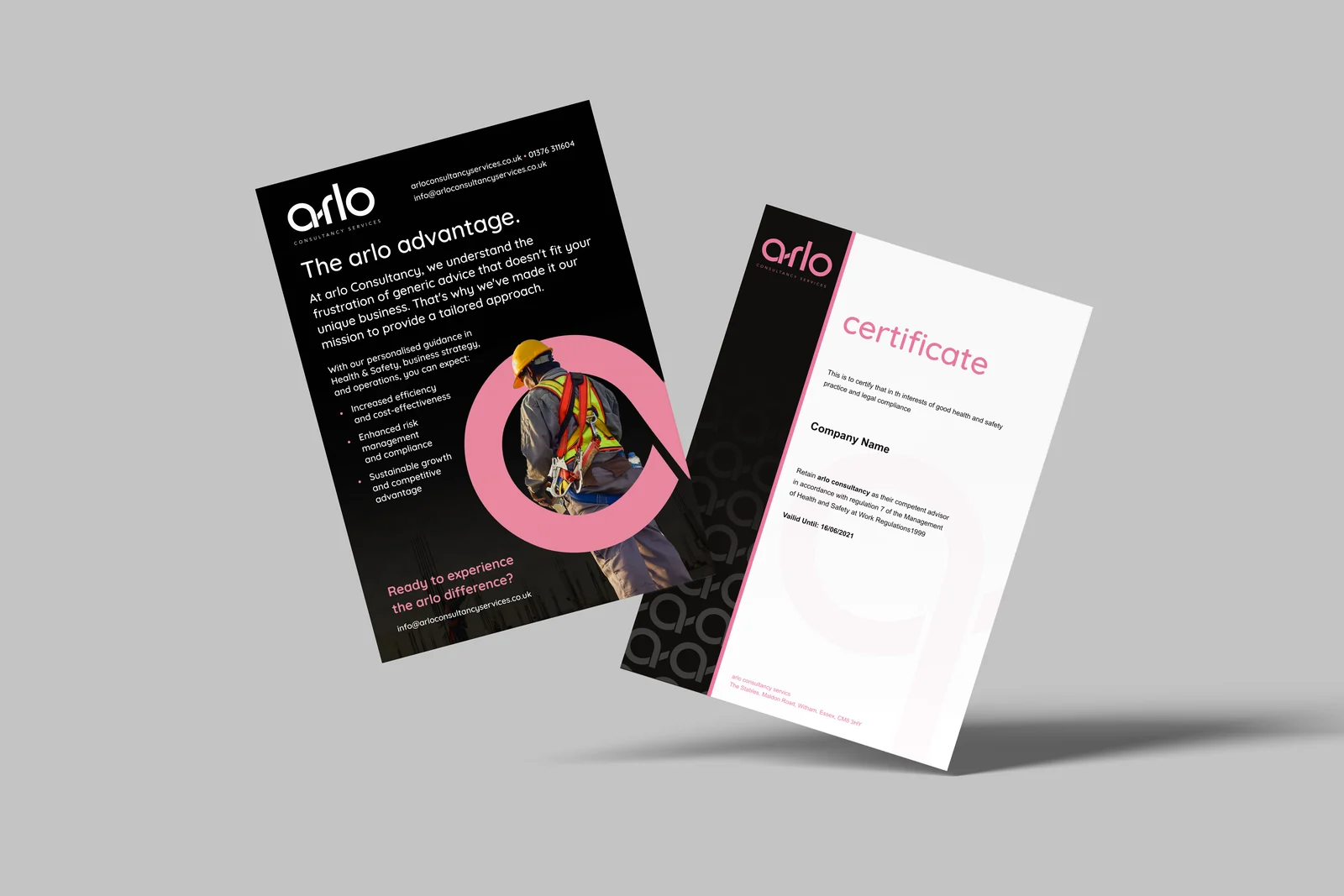
Bringing it to life
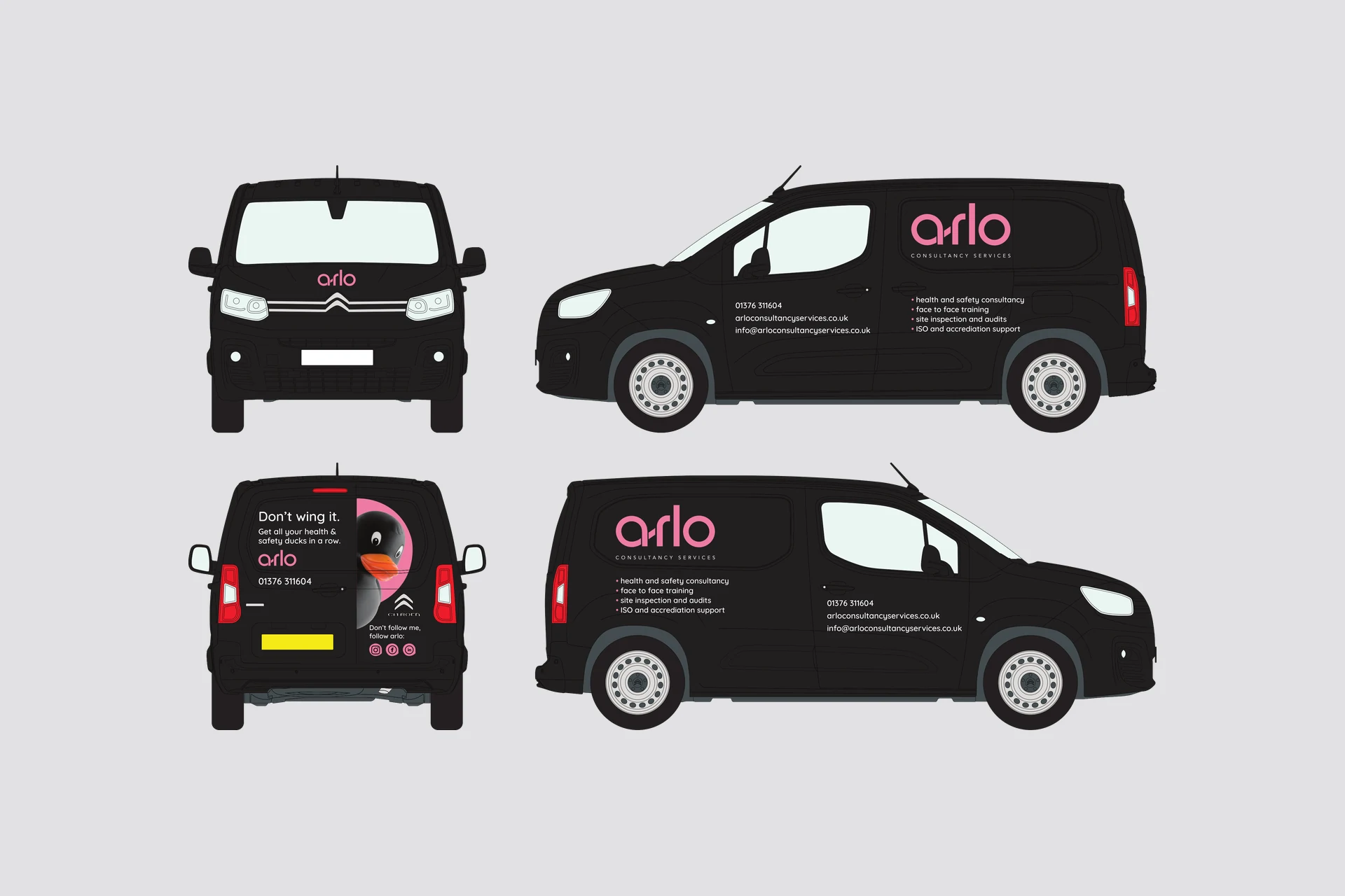
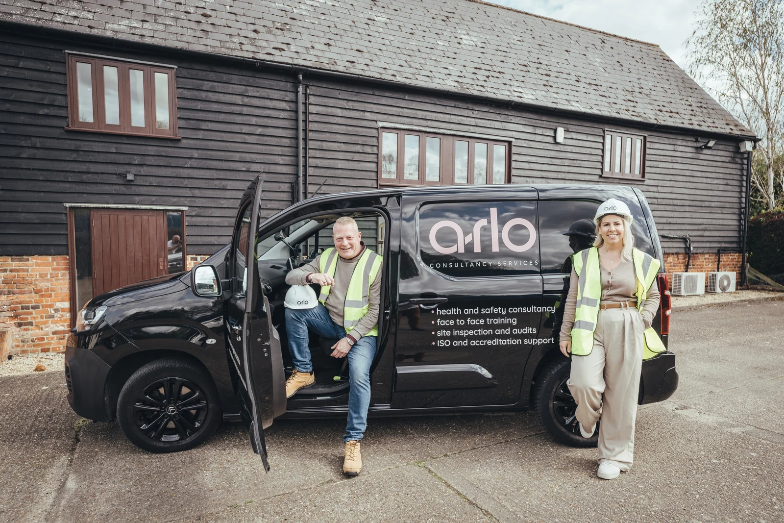
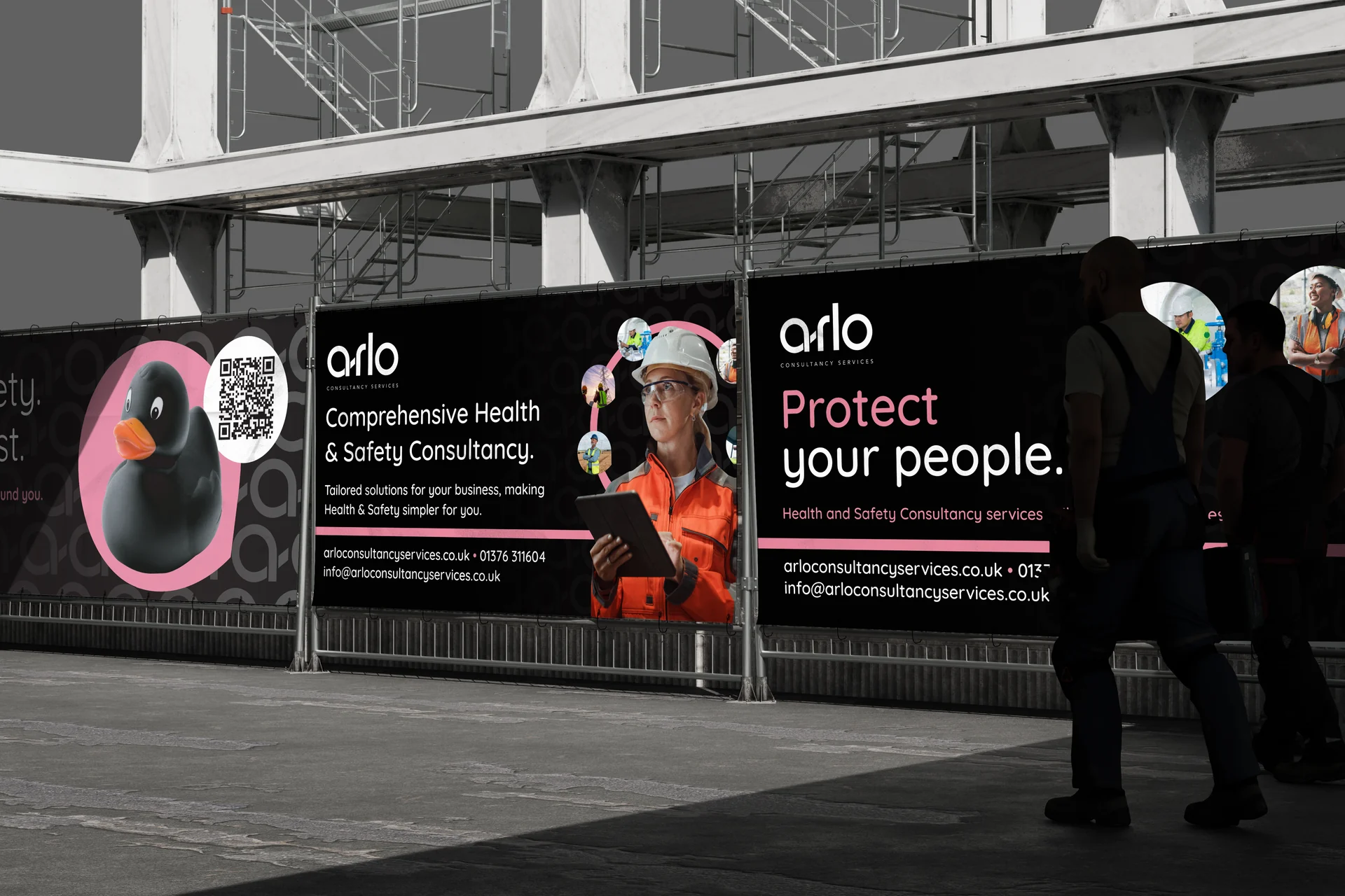
With the identity settled, the job became making it work everywhere arlo shows up. We filmed the team talking about what they do in their own words, then cut it into short stories with branded captions for social media. The website was rebuilt around the new look, with the ducks front and centre and every service easy to find. On the road, the van carries the same confident pink on black, and on site the banners make arlo hard to miss. Business cards, leaflets, posters and training certificates all follow the same rules, so whether someone meets arlo online, on a construction site or across a desk, it feels like one business.