Never grey, never forgettable.
as a unicorn horn
mascot
accountancy clichés
The brief
What started as a bit of fun on social media quickly gained serious traction. The Accounticorn needed a proper brand identity to back up the online noise: one that struck the right balance between a professional accounting service and a memorable, creative personality.
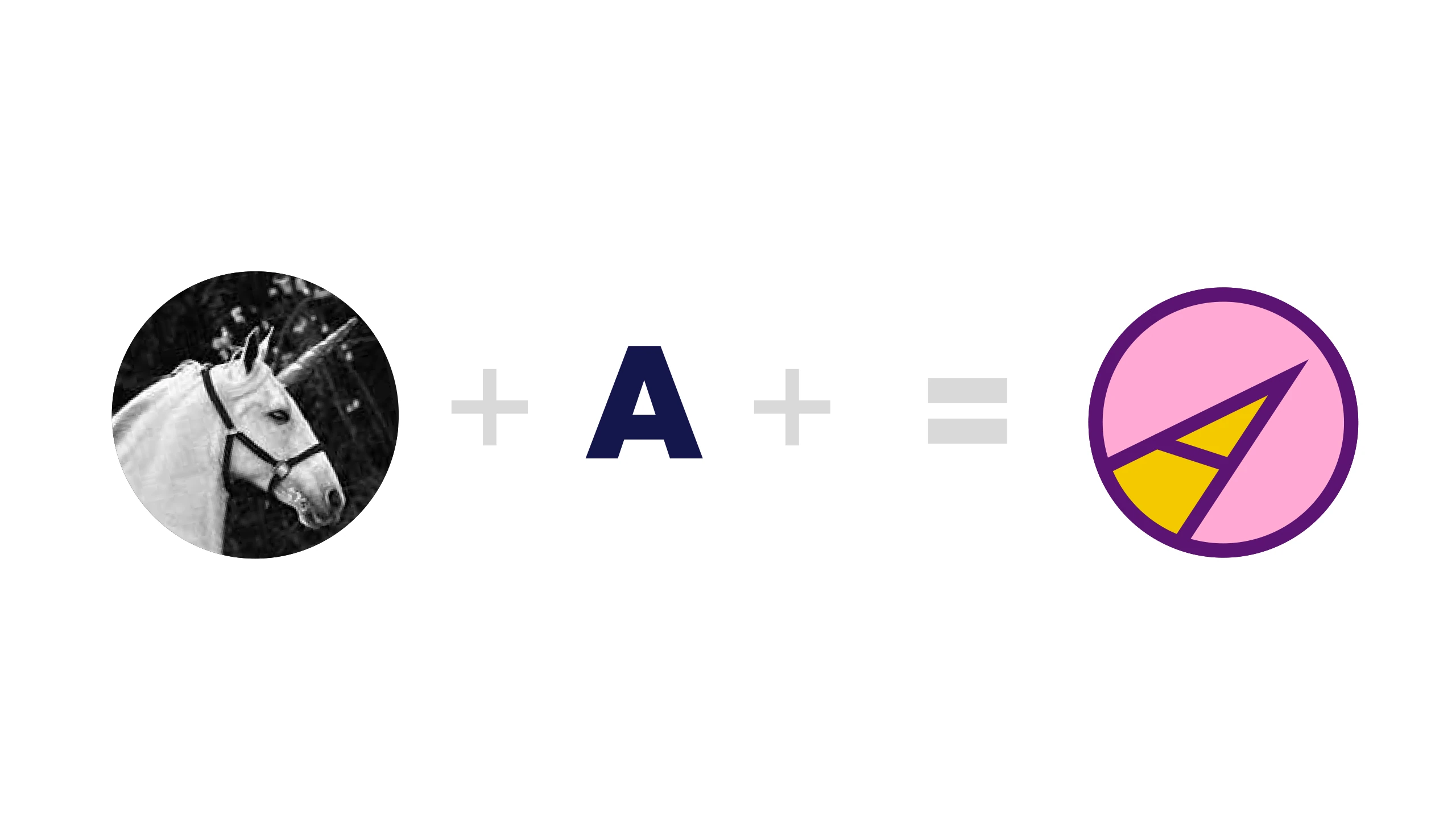
A horn in the A
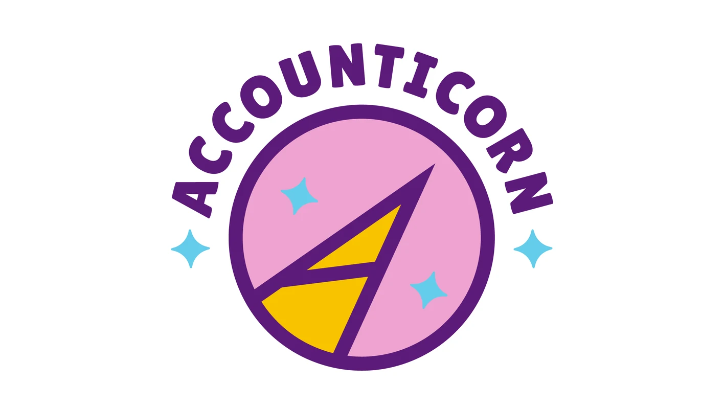
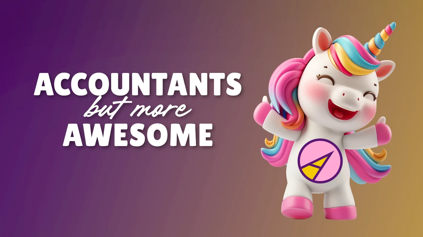
The core logo is a clean, geometric “A” that subtly includes an alicorn, a unicorn horn, without relying on literal or clichéd imagery. We offset this minimal mark with a bold pink background and an abstract “rainbow mane” pattern to bring energy to their marketing, then brought the brand to life with a custom 3D unicorn mascot.
- Client
- Accounticorn
Accountants, but more awesome
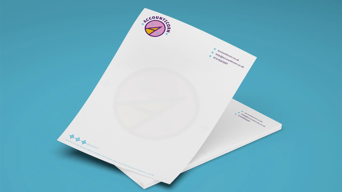
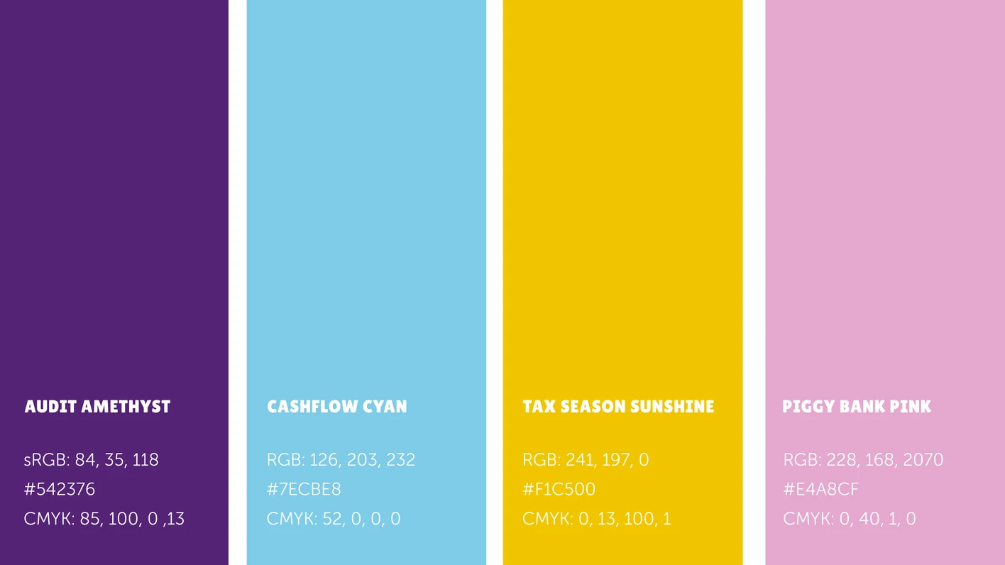
The idea is simple: a letter A that doubles as a unicorn horn. From there we built a bright colour palette, a 3D unicorn mascot and a logo animation for social media, then carried the fun into the practical pieces too, from the letterhead and business cards to the favicon in the browser tab.
The result is a brand that refuses to be ignored: a professional, versatile identity that captures their inclusive, joyful approach to accounting, and proof that an accountant’s brand never has to be grey and forgettable.
See how we approach brand identity design.