Scroll through any social feed for five minutes and you’ll see it. AI-generated graphics, AI-written captions, whole campaigns made in an afternoon. Some of it is brilliant. A lot of it looks the same: the same glossy lighting, the same slightly off colours, the same text that’s nearly spelt right. We don’t think AI is the enemy of good design. Used well, it has a real place. But the businesses getting the best out of it all have one thing in common. They’re not asking AI to guess what their brand looks like. They’re telling it.
AI has a place, done right
Let’s be honest about what AI is genuinely good at. It’s quick at producing variations, so you can see ten directions for a social post before lunch. It’s handy for resizing and reworking a design for different platforms. It can turn a rough idea into a mock-up, suggest a headline when you’re stuck, or help fill a content calendar. For a small team without a designer on call, that’s a real help.
Where it struggles is judgement. It doesn’t know your business, your customers or why you chose that shade of blue. Left to itself, it fills the gaps with whatever is most common, and the most common answer is, by definition, the one everybody else gets too. That’s why so much AI content looks interchangeable. It’s not that the tools are bad. It’s that nobody told them what makes this business different.
Why AI gets brands wrong
- It guesses your colours. “Our blue” means nothing to a tool. Ask for it and you’ll get a blue, just not yours.
- It guesses your fonts. Most AI images can’t use your typeface at all, so text comes out in something close-ish, or simply wrong.
- It redraws your logo. Ask an image tool to include your logo and it will often produce a lookalike, with the proportions and details subtly off.
- It defaults to the average. Without direction, the result drifts towards the same stock style everyone else is posting.
- It doesn’t know the rules. Which logo goes on dark backgrounds, how much space it needs, what you never do. If nobody wrote it down, it can’t follow it.
Every one of those is the same problem. The tool isn’t short of ability. It’s short of instructions.
Your brand guidelines are the instructions
This is where a good set of brand guidelines earns its keep, and it’s why we think they matter more now than they ever have. Guidelines used to be written for designers, printers and sign makers. Now they’re also written for the tools your team uses every day. The clearer they are, the less there is to guess, and the less guessing, the more the result looks like you.
A guide that works for people and for AI covers a few essentials.
- Exact colours. Hex codes for screen, CMYK and Pantone for print, and how much of each to use. Not “navy”, but the precise value.
- Named typefaces. Which fonts, which weights, what each one is for, and a fallback if a tool doesn’t have them.
- The real logo files. Every version, in the right formats, with clear space and minimum sizes, so the actual logo gets placed rather than redrawn.
- Graphic devices. The patterns, shapes, icons and textures that make your brand recognisable, with examples of how they’re used.
- Photography and image style. Real or illustrated, bright or moody, people or products. Describe it, and show it.
- Tone of voice. How you sound, with example lines, and the words you’d never use.
- Dos and don’ts. Shown, not just written. A picture of the logo stretched, recoloured or crammed in a corner says more than a paragraph.
Many design tools now let you save a brand kit with your colours, fonts and logos built in. The ones that do it well are only as good as what you load into them. A proper guide gives you everything you need to set them up once and get it right every time.
Better prompts, better results
The other half of the equation is what you ask for. A vague prompt gets a vague result. A prompt that borrows from your guidelines gets something you can actually use. A few habits make a big difference.
- Be specific about the brand. Give the hex codes, describe the image style and name the feeling you want, in the words from your guide.
- Say who it’s for. “For homeowners in Essex planning an extension” gets a very different result from “for customers”.
- Show, don’t just tell. Most tools let you add a reference image. Use your own best work, not someone else’s.
- Say what to avoid. No stock handshakes, no gradients, no text in the image. Rules work as well as descriptions.
- Leave the logo out. Generate the image, then place your real logo file on top. Never let a tool draw it.
- Treat the first result as a draft. Refine it, then have a person check it against the guidelines before it goes anywhere.
A simple way to make this stick is a short prompt sheet kept alongside your guidelines: a few tested prompts for your regular posts, written in your brand’s language. Anyone on the team can then get a consistent result without starting from scratch every time.
We put it to the test
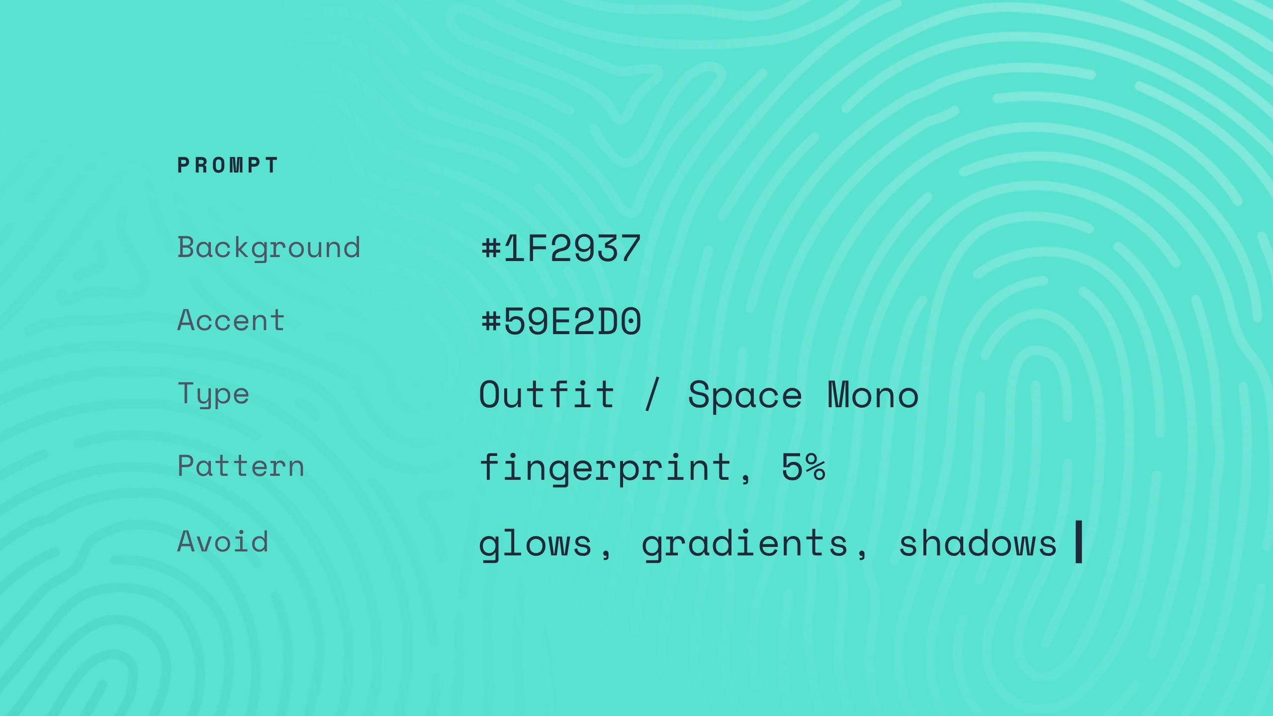
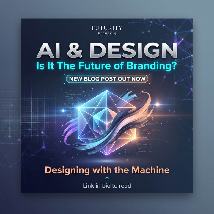
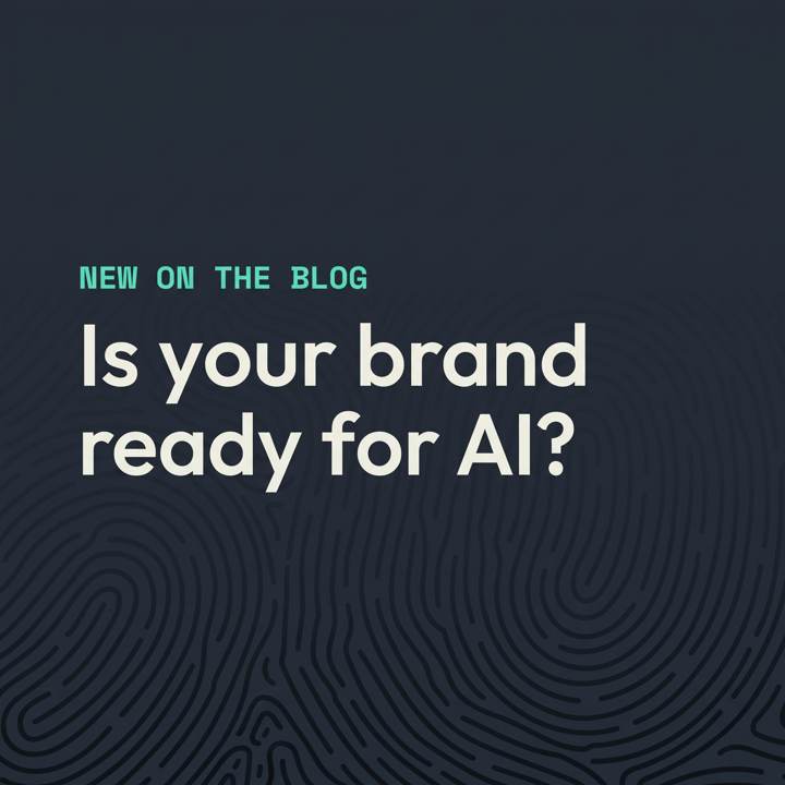
Talk is cheap, so we tried it ourselves. We asked ChatGPT for the same thing twice: an Instagram post announcing this article. The first time, we gave it one line. The second time, we gave it a few lines taken straight from our own brand guidelines, our colours, our type styles and our fingerprint pattern. We didn’t even give it our font files.
The one-line prompt
It had no idea who we were, so it invented a brand called “Futurity branding” and put that at the top. Then it reached for every AI cliché going: a glowing crystal, neon blues and purples, light flares, drop shadows, and lines of fake code that don’t say anything. The headline, “Is it the future of branding?”, could belong to anyone. It looks impressive for half a second, and exactly like a thousand other posts in your feed.
The brand-guided prompt
This one looks like us. Dark slate, the mint label, off-white type, plenty of space and our fingerprint pattern, with the top corner left clear for the real logo. It took about the same time to make.
It isn’t perfect, and that’s worth saying. The pattern came out much stronger than the faint background we asked for, and it’s been redrawn rather than taken from our file. The typeface is a close lookalike, not our actual font, because we didn’t give it one. A designer would still finish it: correct the type, knock the pattern back and place the real logo. But it went from guessing to nearly there, and the only difference was the instructions.
That’s the whole argument in two pictures. The tool was the same both times. What changed was how much it knew about the brand.
Where a person still matters
AI is a brilliant assistant and a poor creative director. The thinking that makes a brand work, understanding what you stand for, who you’re talking to and why someone should choose you over the business down the road, still comes from people. So does the judgement to know when something is nearly right but not quite.
Your logo, in particular, should always be designed by a person and owned outright by you. Ownership of AI-generated artwork is far less clear-cut, and a mark that a tool produced could be very close to something it produced for someone else. It’s the one part of your brand you can’t afford to share.
How we help
Every brand identity we create comes with guidelines, and we now write them with both people and tools in mind: exact colour values, named typefaces with fallbacks, every logo version you’ll need, the graphic devices and the image style, clearly shown. If you already have a brand but no proper guide, or a guide that lives in someone’s head, we can put one together from what you have. And if your team is using AI to create content, we can add a prompt section to your guidelines on request. It works like a tone of voice page, but for AI tools: tested prompts written in your brand’s language, so whoever is typing gets results that look and sound like you.
You can read more about how we approach branding, the difference between a logo and a full brand identity, or see brand guidelines in action in our work.
FAQs
Can AI design my logo?
It can produce something that looks like a logo, but we wouldn’t recommend it. Your logo needs to be original, work at every size and be yours outright. Those are exactly the things AI tools are weakest at.
Will AI replace designers?
It’s changing how design work gets done, and it’s taking on a lot of the repetitive production. The strategy, the ideas and the judgement still need people, and the better the brand thinking behind it, the better AI performs.
Do I need brand guidelines if I’m a small business?
Yes, especially if more than one person creates your content or you’re using AI tools. A short, clear guide is enough to start with. What matters is that the colours, fonts and logo rules are written down rather than guessed.
Free mini brand audit
Is your brand ready for AI?
Tell us about your business in five minutes. We’ll send back your brand score, how you compare with a competitor and the three changes that would make the biggest difference.
Get my free mini auditOr take the 10-point brand check first, see how we approach branding, or look through our work.