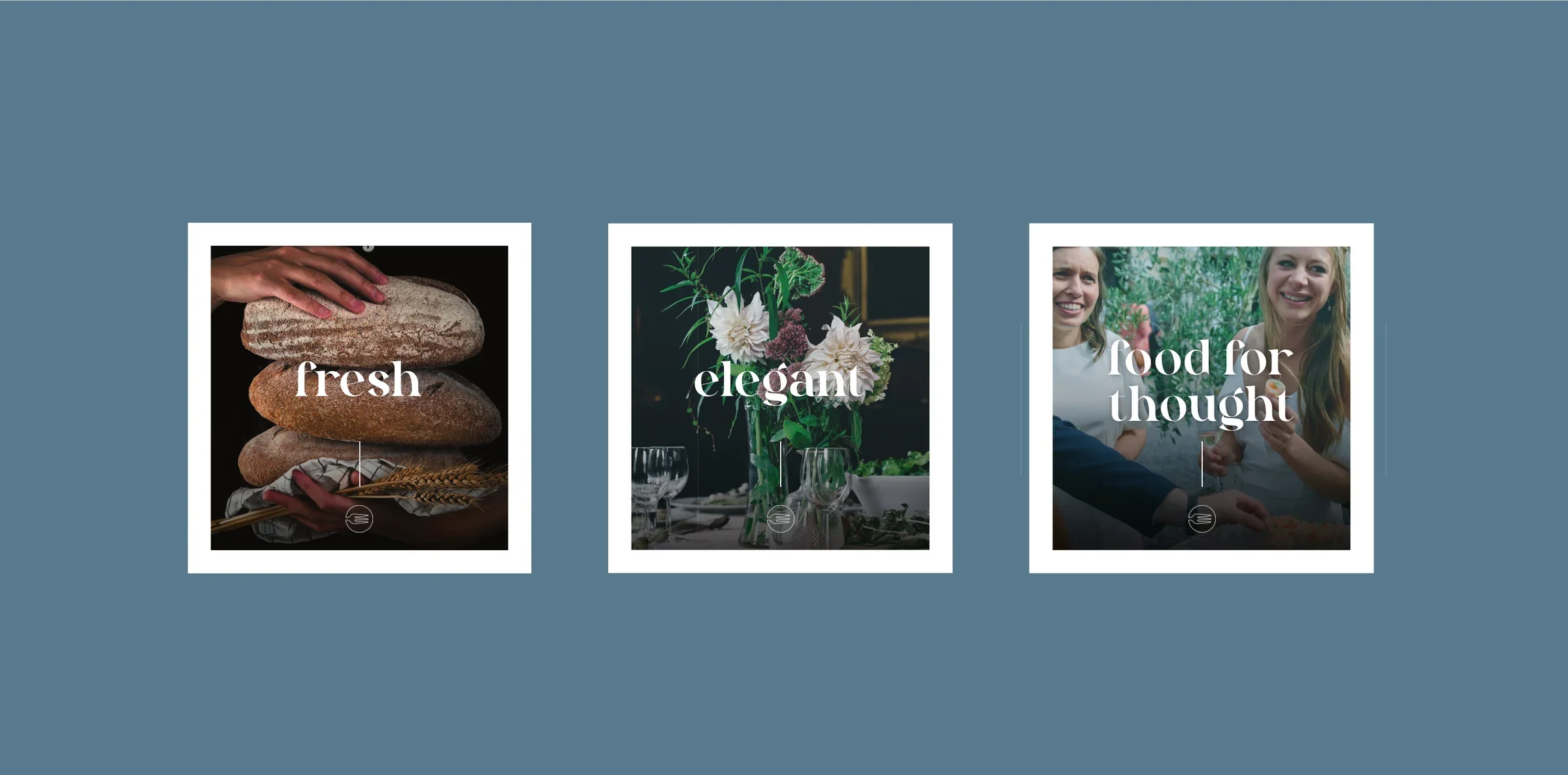
The Event Catering Co. cooks for every kind of occasion, from relaxed street food to elegant wedding breakfasts, all made from fresh, locally sourced produce. They needed a brand that could sit comfortably at both ends of that range and look as considered as the food.
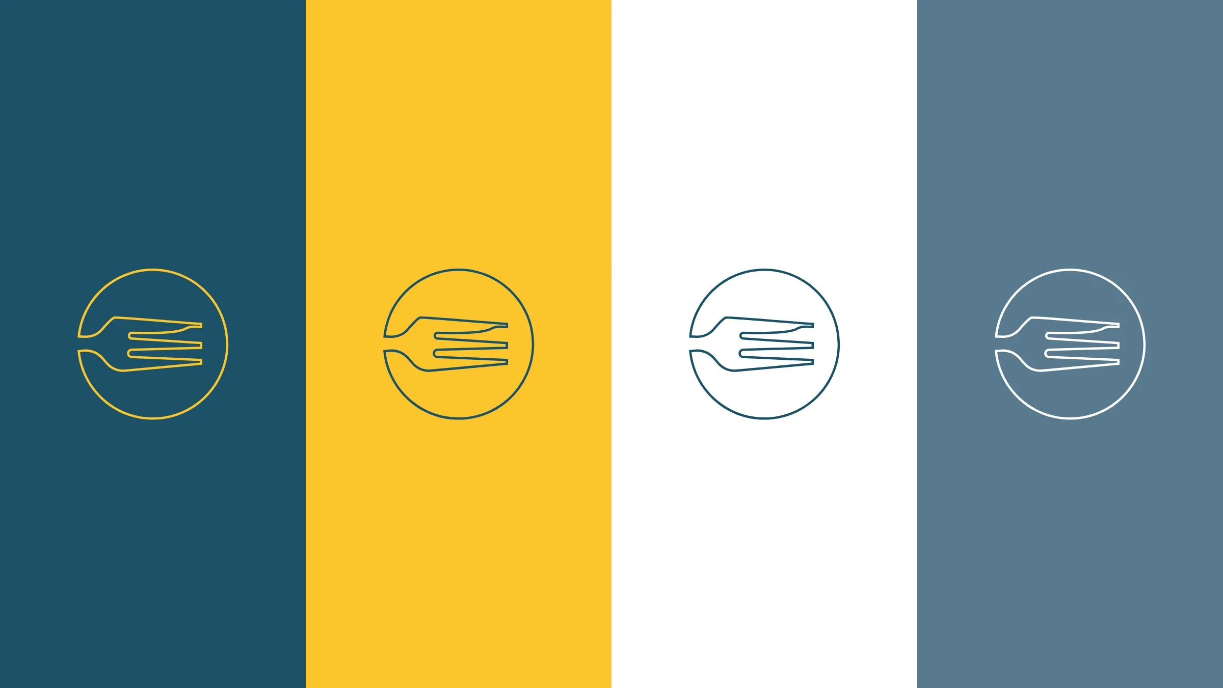
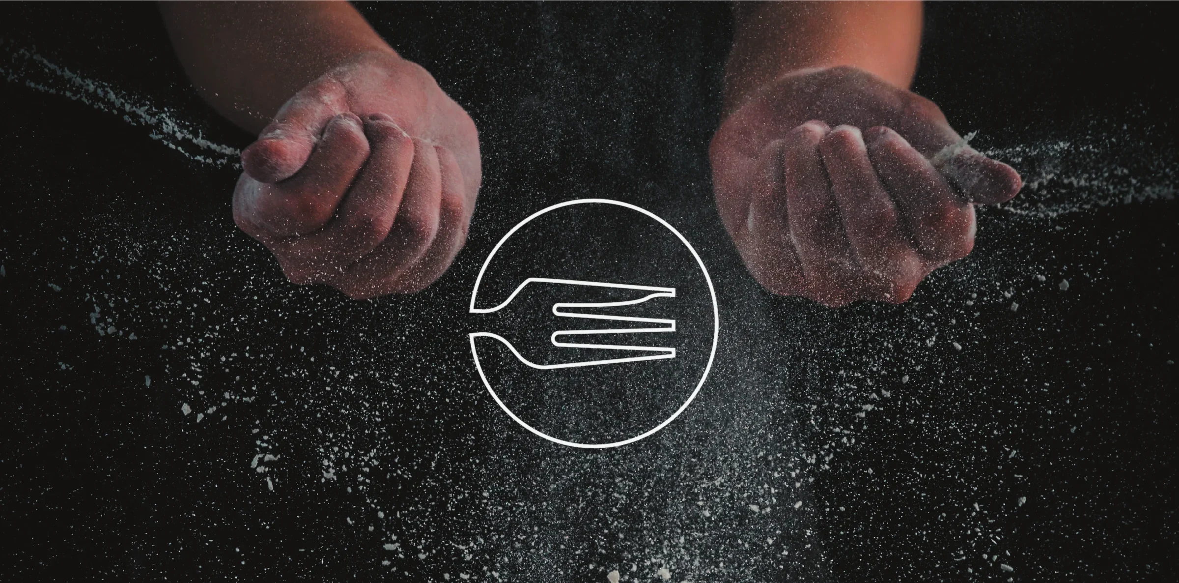
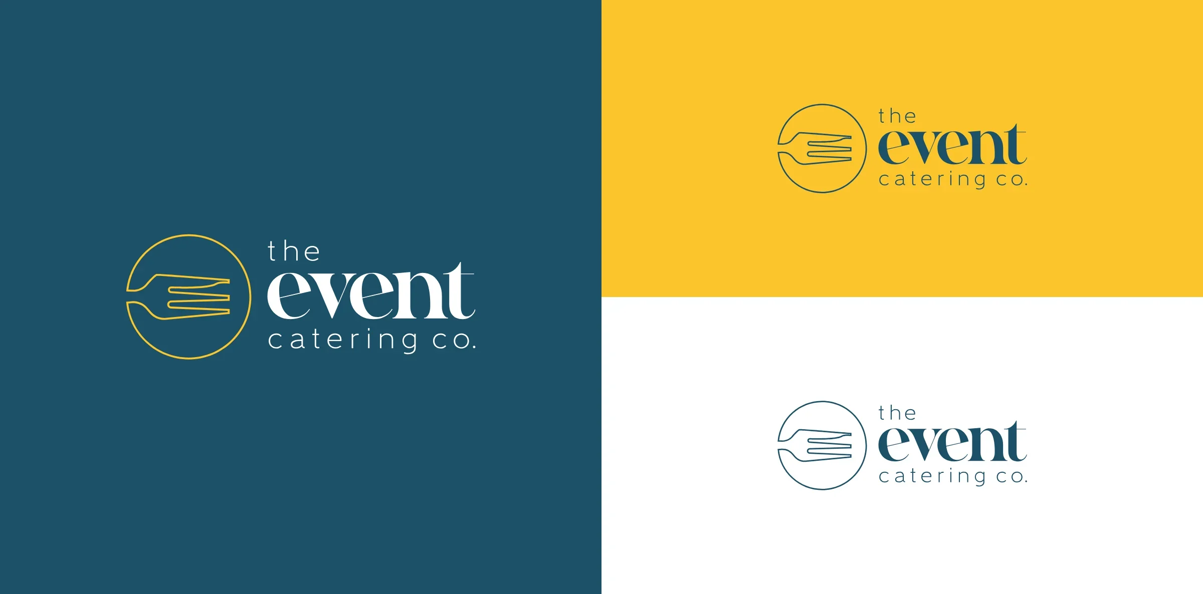
The idea came from the table. The mark is a three-pronged oyster fork, its prongs forming the “e” of event, and a nod to the Mersea oysters and local ingredients at the heart of their menus. Set inside a circle like a plate, in gold on a deep teal, it balances modern with classic elegance.
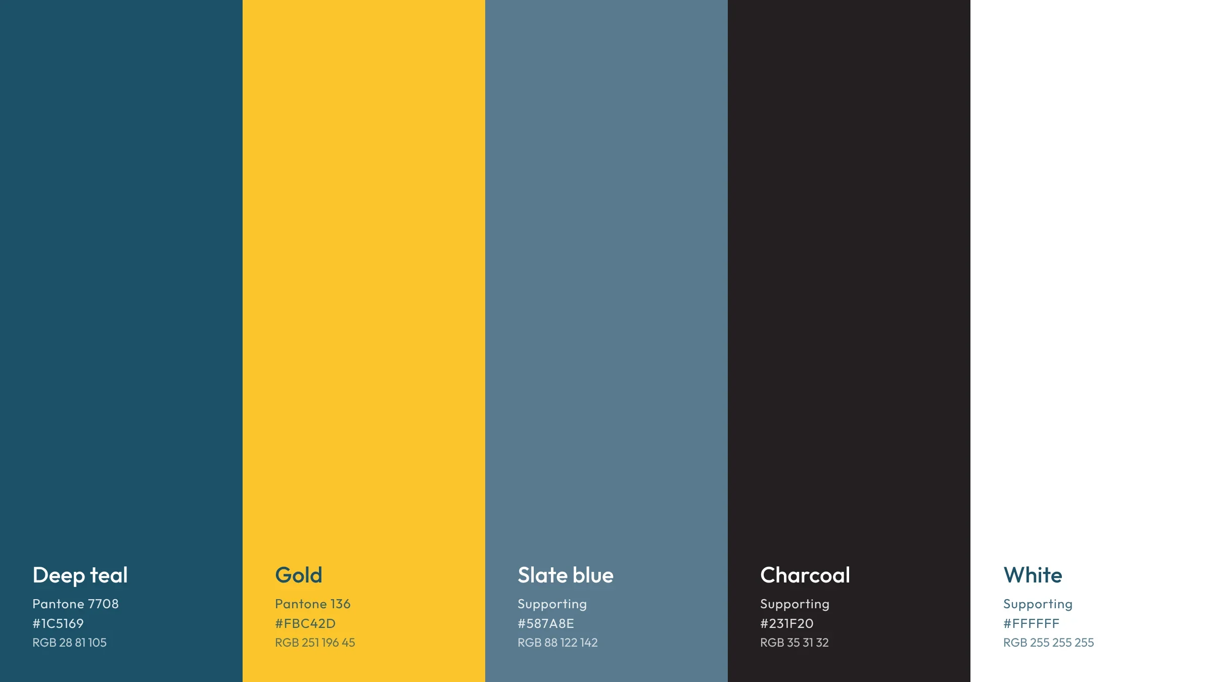
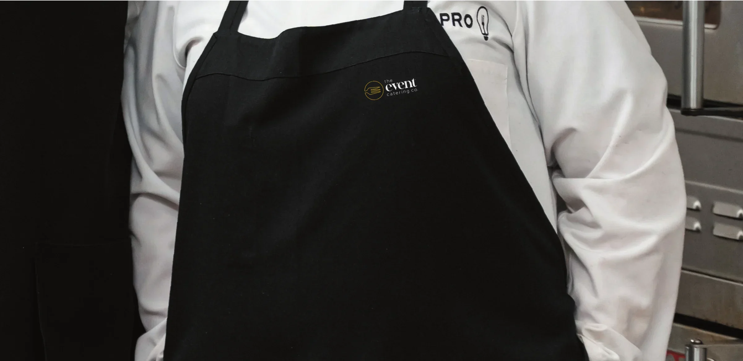
Around it we built the full identity: a set of colourways that work on any background, a pattern made from the mark, social media templates, uniform and van livery.
- Client
- The Event Catering Co.
- Sector
- Events & catering


Made for every table
A catering brand has to work hard in some very different places: on a menu at a wedding, on an apron at a street food stall and on the side of a van at six in the morning. So every piece follows the same simple rules. The gold mark leads, the teal holds everything together, and the fork pattern fills the space when there is room for a little more. On social media, short single words like fresh and elegant let the food do the talking.
See how we approach brand identity design and social media.